

This post formed the basis of an article that appeared in the November 2018 edition of the ASX Investor Update on 13 November 2018.
The ASX Investor Update is a monthly newsletter that is emailed out to over 200,000 subscribers.
Michael Gable is a regular expert contributor to the ASX. You can access the ASX version of the article HERE.
After a relatively calm 2017, global equity markets look set to end 2018 a little differently. Volatility is back. After taking a tumble in February, share markets across the globe have done the same again during the months of September and October. I use technical analysis every day to assist with my entry and exit points. When markets take a turn for the worse, the ordinary investor starts to take more of an interest in technical analysis. Investors now want to know whether markets are close to support, if there is more downside, and whether I have seen enough evidence to swoop in and start buying. Here I will give you my opinion on what the major market indices have done until now. I will also give you my thoughts on what we have in-store for 2019, along with some general advice on what to look out for.
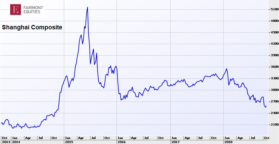
Shanghai Composite
The Shanghai Composite contains all the A-shares and B-shares which are traded on the Shanghai Stock Exchange. The Chinese market is still fairly new compared to the other major stock markets. Unlike other markets, the majority of traders are individuals instead of institutions. This is one of the reasons for why the index is so volatile. The last 5 years has seen the index head from nearly 2000 points to over 5000, and then back towards 2500 – not for the faint hearted. This year alone has seen the index shed over 20 per cent. Despite this, I can see signs of support on the chart. This 2500 zone appears to offer support and for the moment we seem to be getting it. I believe that 2019 could be a good year for Chinese equities as the Shanghai Composite seeks a recovery.
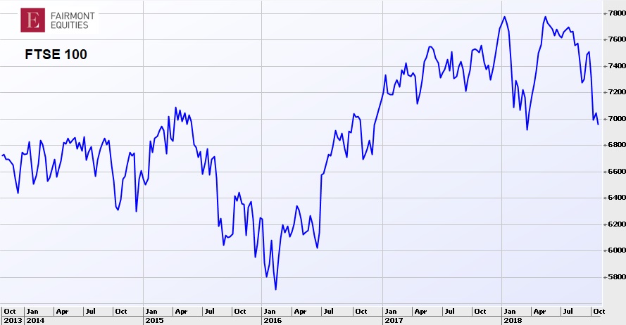
FTSE100
The FTSE100 is the index of the top 100 companies on the London Stock Exchange by market capitalisation. Having a look at the last 5 years, we can see that there was a decent decline over the course of 2015. We then saw a sharp rally in mid-2016 because of the Brexit vote. What I find very interesting with the FTSE100 is the price action during 2018. It started with a sharp sell-off from about 7800 to 6900. It then managed to recover quite quickly, surpassing the peak at the start of the year. Although it was nice to see the market recover, it did so too quickly. For as soon as it got to the old high around 7800, the selling kicked in. This tells us that the FTSE100 clearly has no place being anywhere near 7800 yet. At some point it will, but it will take time. Many market tops have come in on the back of a similar formation and the FSTE100 this year has been a textbook example of a market top. At the current rate of selling, I can imagine the FTSE100 falling under the 2018 low, possibly towards support near 6600. From there it will be in a better place to recommence a move higher.
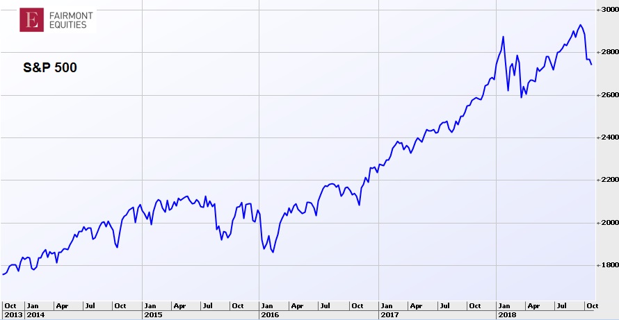
S&P 500
The S&P 500 contains the largest 500 companies by market capitalisation on the New York Stock Exchange and NASDAQ. The Dow Jones Industrial Average only contains 30 companies, and it is weighted by price, making it a little less useful. Having said that, the charts for both indices look very similar. That is, both have performed amazingly well since the lows in 2009. The trend has been very strong, and when I trade US stocks for some of my clients, it can sometimes feel like shooting fish in a barrel. However we cannot become complacent. The record run of low volatility that was seen during 2017 has come to an end and we are getting a bit of movement back in the S&P 500. Market tops come in on euphoria, not pessimism, and there is plenty to be pessimistic about at the moment. Looking at the chart though, the recent dips appear healthy and the rallies appear sustainable. Some analysts talk about the index looking “overbought” and momentum indicators showing “divergence”. Remember though that this is common in strong trends. The S&P 500 has been overbought and showing divergence for several years now, and that hasn’t stopped it doubling in value. Although it does look as though the S&P 500 could do with a breather. We may see it go lower and retest the 2600 level some stage soon. Once that happens, we should see it resume the uptrend and make new highs in 2019. There are no major warning signs now to indicate otherwise.
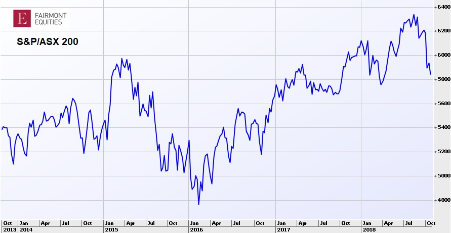
S&P/ASX 200
The S&P/ASX 200 has been steadily rising for the last few years. Although its progress has not been as great as the US market. Remember though that the Australian market doesn’t have the great tech stocks (the FAANG’s) that the US has. Also, over half the S&P/ASX 200 is dominated by only 20 stocks, concentrated in banking and resources. In the months of September and October we have seen the S&P/ASX 200 pull back from its highs, erasing a years’ worth of gains. When I step back and look at a longer-term chart, I still see one that is trending higher. As we get towards the pre-GFC high near 6800, our market will see some volatility. It is normal to see a bit of movement near an old high as investors debate whether we can break through it or not. For our market, there are no major warning signs yet. Although I can’t predict where we will end 2018, over the course of 2019, based on the current trend, I can be confident that the S&P/ASX 200 will see higher levels.
What does this all mean?
Apart from the FTSE100, which looks a bit vulnerable, other share markets appear well placed to head higher. Despite 2018 not looking like a great one for share markets in general, it appears 2019 will be better. Having said that, we are towards the end, not the beginning of the bull market. The index may go up, but not necessarily all stocks. In Australia, the banks with their current headwinds are a case in point. I would be advising investors to look past the index and drill down to individual companies. Look at the charts for each individual stock. When you combine that with good fundamental analysis, it means that your share portfolio has the best chance to grow.
Current share prices available here.
You can learn more about technical analysis in this article.
An 8-week FREE TRIAL to The Dynamic Investor can be found HERE.
Michael Gable is managing director of Fairmont Equities.
Sign up to our newsletter. It comes out every week and its free!
Would you like us to call you when we have a great idea? Check out our services.
Disclaimer: The information in this article is general advice only. Read our full disclaimer HERE.
Like this article? Share it now on Facebook and Twitter!
Charts courtesy of IRESS