
Technical Analysis is a method of analysing supply and demand in the market by looking at price movements and volume. It can visually show how emotions are driving stock prices higher or lower. By understanding this, you will be able to identify when stock prices are running ahead of themselves or if they are being oversold. That is, technical analysis can show us when the market is unable to push a stock any higher and therefore it is likely to drop. Conversely, it can show us that there is buying pressure in a stock and we may therefore have an opportunity to purchase a company that is about to go up in price.
How do you use Technical Analysis?
To get started in Technical Analysis, you need to do the following:
- Convert your chart to a candlestick chart
- Understand charting patterns
- Learn about candlestick reversals
- Find a suitable indicator
- Learn Elliot Wave analysis
- Combine technical analysis with fundamental analysis (most investors fail to do this last step)
Different types of charts
A typical line chart shows the closing price of a stock and how it changes over time. It is made by grabbing the closing price each day and plotting that over time. However, share prices move a lot during the day. Unfortunately your normal chart doesn’t capture this information. These line charts are what most people look at, but it’s like watching a black and white television.
The chart above lacks detail. We can tell roughly where a stock is heading, but there is no detail on how it is trading. Sometimes a stock will start the day at a high level, but see a lot of selling during the day. Sometimes a stock will start the day at a low point but see sustained buying during the day. Both situations tell us something interesting about the demand for a stock, but that doesn’t get captured on a line chart.
The first step to technical analysis is to convert your chart into one which gives us more information. Our preference is to use a “candlestick” chart.
A candlestick chart is more useful for technical analysis as it will show for each time period the opening and closing prices as well as the lows and highs during that time period.
Uniquely combining both Fundamental and Technical Analysis
Not yet a subscriber? Join now for FREE!
Receive our weekly tips and strategies into your inbox each week.
BONUS: Sign up now to download our 21 page Trading Guide.
Below is a breakdown of a what each candle represents:

Now let’s look at that same line chart, but convert each day into its own individual candle:

It is like we have bought ourselves an HD colour television and the detail is jumping out. Seeing these ranges on a chart provides investors with much more information to make better investment decisions.
Below is a weekly chart of the same stock. That is, each candlestick represents a week’s worth of price action.

Once you start to become familiar with the candlesticks, at first glance you will be able to see whether a stock is trading in a “bullish” or “bearish” way.
Technical Analysis of chart patterns
With technical analysis we use charting patterns to analysis stocks. A chart pattern is when prices on a chart form a particular shape. These shapes show us graphically the behaviour of traders in the market and this means that we can make some predictions on what might happen next.
Chart patterns generally fall into two types:
- Continuation Patterns. These tell us that a trend is likely to continue.
- Reversal Patterns. This is where a trend (up or down) is likely to come to an end.
1. Continuation Patterns
A continuation pattern occurs during a trend and it can indicate that a trend is likely to continue even further. An amateur trader may see certain price movements occur and believe that they need to exit a position. An investor familiar with continuation patterns could therefore know to stay with the position, or even enter a new position in the knowledge that there is further to go with the preceding trend. There are a variety of continuation patterns. Let’s now look at some examples in practice.
Flags
A flag is a continuation pattern that looks like a rectangle. It tends to move against the trend. That is, if the trend is up, then the flag will see the price move down during that time. Flags are bullish signals indicating the stock will advance to a higher price.
Price action, as in other continuation patterns, should be more “corrective” compared to the “impulsive” move preceding it.
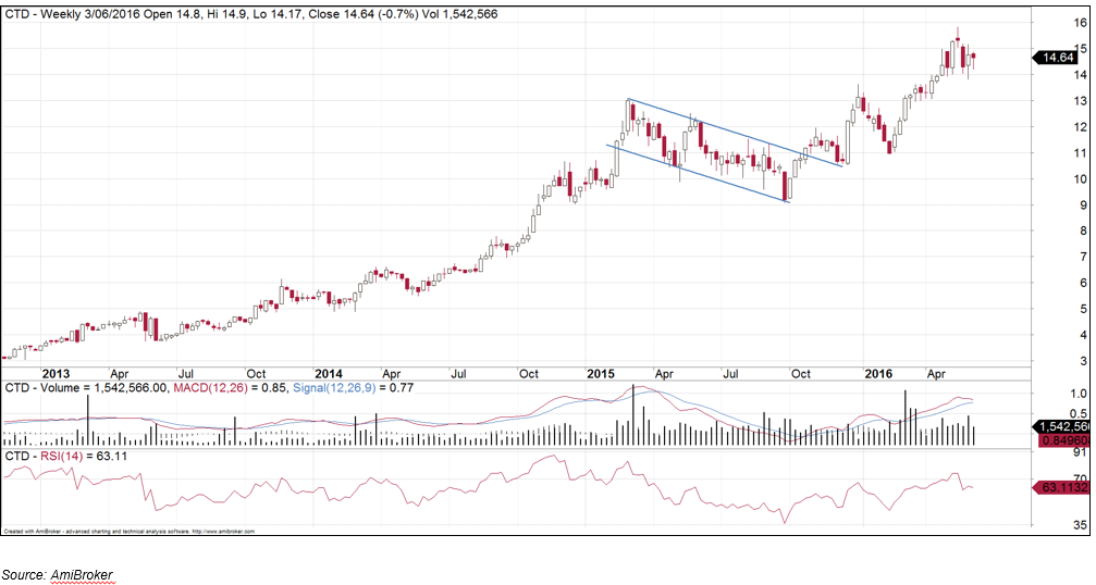
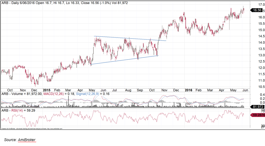
Pennants
A pennant is similar to a flag but it resembles that of a symmetrical triangle. These are bullish patterns start where there is a large upwards movement in the stock and then a period of consolidation where support and resistance merge together. This consolidation period is the result of some traders exiting long positions and some traders buying into positions waiting for a reversal. Then there is a breakout in the same direction. Pennants are a positive sign the security is following a bullish trend.
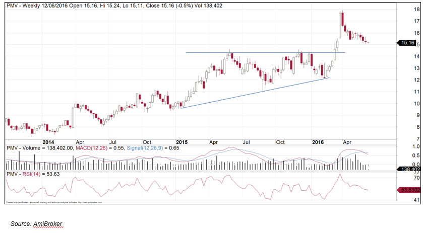
Ascending triangle
An ascending triangle is similar to a pennant but it can be more powerful as (in the case of an uptrend) the top side is horizontal. The top part of the triangle is flat, while the bottom part of the triangle has an upward slope. This indicates there is a line of resistance and the rising trendline show that investors are willing to pay higher and higher prices over time.
This consolidation pattern indicates that a bullish breakout is imminent. The breakout should consist of stronger than normal volume. The higher the volume, the more effective the breakout is.
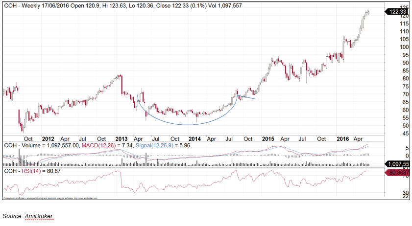
Cup and Handle
This is a bullish consolidation with price consolidation followed by a breakout. When price action rounds out, and is then followed by a slight easing back. Upside target is usually equal to the depth of the cup. This pattern displays a bullish sentiment with possible further price increases.
2. Reversal Patterns
A reversal pattern indicates that a previous trend is about to reverse and head the other way. Some common reversals include:
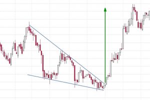
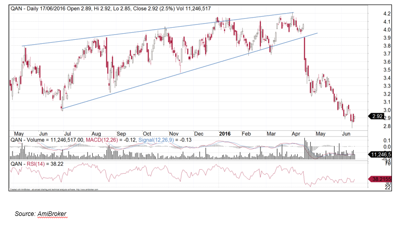
Rising wedge
A rising wedge appears at the end of an uptrend and considered a reversal pattern. It is formed by higher highs and higher lows within a contracting range. The shares are still trading higher but within a tightening range. Once this breaks, the shares tend to trade back towards the base of this wedge as the market is losing the uptrend strength.
Double top
A pullback from a peak is then followed by a retest and failure of that level. The double touched high is considered a resistance level. The two peaks are approximately the same price which is separated by a valley (price low). This minimum price is also called the neck line. This is a bearish pattern indicates further price decline especially if prices fall below the neck line.
Candlestick reversal patterns
We can also analyse individual candlesticks to identify reversals.
These include:
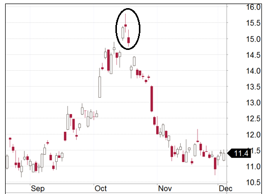
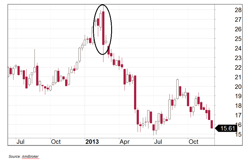
Shooting star
This is a reversal pattern and is found in an uptrend. The candle displays a small body with a long shadow on top. The distance between the highest price for the day and the opening price must be more than twice as large as the body of the candle. The shooting star sign is most clear when it forms after a series of three or more rising candles with higher highs. The shooting star candle is confirmed by the candle that comes after it. That candle needs to fail to make a higher high and close to under the prior candle. The shooting star is a signal that the bullish trend is now becoming a bearish one.

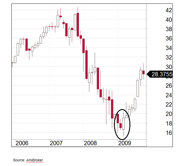
Hammer
This bullish reversal pattern typically occurs after a prolonged downtrend. The security trades much lower than its opening but rallies to close to above the opening price. The body is at least half the size of the tail. The lower shadow must be at least twice the height of the real body. Hammers are most effective when they are preceded by three or more consecutive declining candles. The hammer candle is confirmed when the candle which succeeds it closes with a higher low than the hammer candle. This action indicates buyers are buying in this pullback. The hammer pattern indicates that a previously bearish trend is now turning bullish.


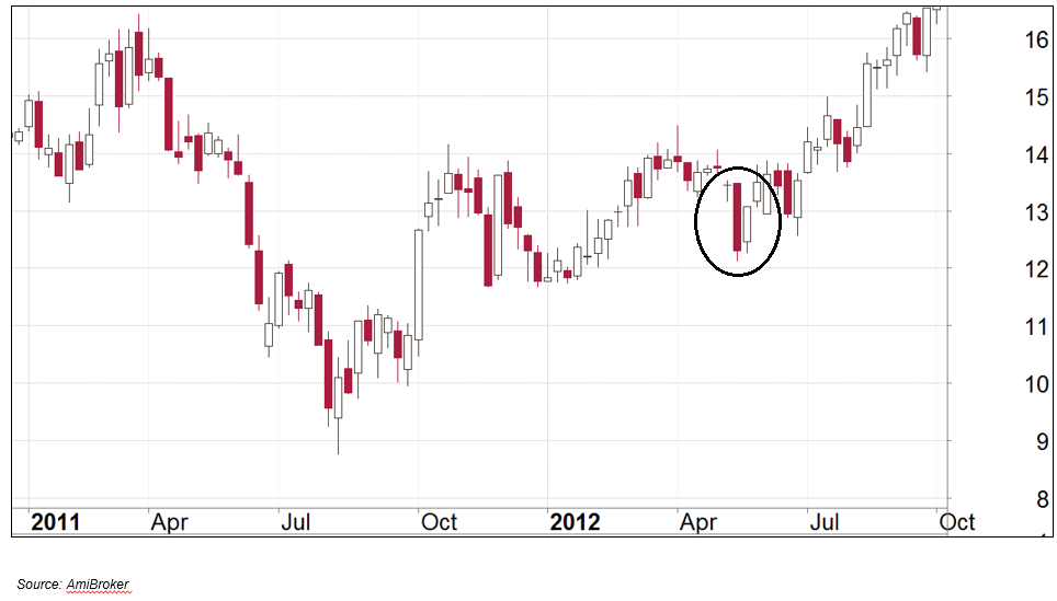
Bearish engulfing pattern
A bearish candlestick engulfs the bullish candlestick completely. The first candle is a bullish candle but it is overtaken by the second candle which is a bearish one. This pattern usually occurs during an uptrend and indicates the start of a bearish trend in the security. It also indicates a change in investor sentiment and may suggest the stock has reached its upper limits of its value.

Bullish engulfing pattern
Occurs when a large bullish candle engulfs the bearish candlestick from the period before. This candlestick may indicate a potential reversal of the current bearish trend and into a bullish trend. The second candle opens below yesterday’s close and almost covers half the body of the bearish candle. This pattern normally occurs after a period of a down trend as the large move in price signifies an upward trend towards higher highs.

The piercing pattern
The first candle is a bearish one and the second on is a bullish one. The second candle should open below yesterday’s close and cover 50% body of the bearish candle. It occurs on a downward trend and indicates the security is now heading towards an upwards trend.

3 Black Crows
This Is a bearish reversal pattern of three bearish candlesticks. There should be an uptrend in progress and these bearish candles disrupt this uptrend. Each of these candles must open below the previous day’s open and each candle must close lower, creating a new low. This pattern shows the bullish sentiment of the security has been changed to a bearish one.


What are indicators in technical analysis?
Indicators use price and volume to derive other measurements such as volatility and momentum.
It is important to remember that they are derived from price and volume. This means that they play a supportive role to the price action. They should not be used in isolation to make trading decisions.
Some indicators are leading such as the Relative Strength Index (RSI).
Others are lagging indicators such as the Moving Average and the MACD.
Relative Strength Index (RSI)
RSI is a momentum indicator that measures the speed the share prices are changing by comparing the recent gains and losses over a specified time period. This indicator can identify points where there is a change in trend. It can signify when a stock is overbought and when a stock is oversold.
This indicator shows whether the bulls or the bears are the strongest in the market, it uses the closing prices of completed trading periods to distinguish whether it is a bull or bear market. Prices that close higher are strong markets and prices that close lower are bear markets. The RSI computes this as a ratio of the number of higher closes to the lower closes during a period of 14 days.
When the RSI is above 70 it is overbought and when it is below 30 it is oversold. A movement back under 70 generates a sell signal, and back above 30 generates a buy signal.
Typically, we use a 14 day period.

Moving Average (MA)
Moving Average – MA – Is a trend following indicator. It can identify the support and resistance of a stock price. It is calculated by adding up the closing prices of a stock for a specified period and then dividing the sum by the number of observations. Most traders use the 50 day and 100 days to calculate the moving average. Once these averages are calculated, the two moving averages are plotted together to determine cross over signals. One is a relatively short moving average and the other is a long moving average A buy signal is generated when the shorter moving averages crosses over the longer moving average. A sell signal is generated when the longer shorter moving average crosses below the longer moving average.

Moving Average Convergence Divergence (MACD)
This momentum indicator shows the relationship of two moving averages of prices. The MACD is calculated from subtracting the 26-day exponential moving average (EMA) from the 12-day EMA. A signal line which is the nine day EMA is then plotted on top of the MACD and this line will identify buy and sell signals.
When the MACD line crosses the 9 day trigger EMA line, then a buy signal is triggered. When the 9 day EMA line crosses over the MACD line then a sell signal is presented.
Elliott Wave Analysis
In this principle, the movement of the stock market can be predicted by identifying patterns of waves. It’s inventor observed markets move in wave cycles and that collective crowd psychology move between bearish and bullish sentiment. These patterns consist of 5 waves in the direction of the primary trend and then followed by a set of 3 waves opposite to the direction of the main trend.
Elliott Wave Theory consist of the following principles:
- Action is followed by reaction
- There are five waves in the direction of the main trend followed by three corrective waves (a
5-3 move)
- This 5-3 move becomes 2 subdivisions of the next higher 5-3 wave (waves within waves)
- The underlying 5-3 patterns remains constant, though the time span of each may vary
Elliott Wave Pattern:
- A basic pattern is made up of 8 waves (5 up and 3 down) labelled 1, 2, 3, 4, 5, A, B, C
- Impulse waves are waves 1, 3, 5
- Corrective waves are waves 2 and 4
- The A,B,C waves correct the main trend from 1 to 5
Elliott Wave Rules
- The corrective second wave can not exceed the start of wave 1
- The impulsive third wave can not be the shortest of the three impulse waves
- The fourth wave does not overlap with the price territory of wave 1, except within a diagonal triangle
5 wave movement
- Wave 1 (Impulsive) – First half of this wave is the basing process. This will be later corrected by wave 2. Market breadth and volume will increase slightly. Wave 1 is the shortest of impulse waves.
- Wave 2 (Corrective) –Wave two corrects wave one. These waves retrace much of Wave 1 but never to 100%. There is low volume and volatility in this period. Prices do not retrace more than 61.8% of the wave one gains.

- Wave 3 (Impulsive) – They are usually the largest and most powerful wave. There is strong confidence in the new direction. This wave has the most volume and price movement. Waves 3’s are the most likely wave to extend. This is the most volatile point of the new trend. The 3rd wave cannot be the shortest of the 5 impulse waves.
- Wave 4 (Corrective) – Fourth waves tend to be range bound waves which do not extend very far. Because of this, the bottom of the fourth wave will never be equal to the peak of the first wave. Volume is lower than the other three waves.

- Wave 5 (Impulsive) –These waves convey a weakening in price trend. Sometimes there will be slower speed of price change than the previous waves, and also lesser volume and breadth.

- Wave A: (Corrective Wave)
Participants of the market will believe this wave is a correction of the previous trend. If Wave A is divided into five sub-waves, it will be a zigzag. It will be a flat or a triangle if it is divided into three sub-waves.
- Wave B: (Corrective Wave)
This wave usually misleads people in the wrong direction. This is because prices reverse higher. The volume in Wave B should be lower than in Wave
- Wave C: (Corrective Wave)
Volume picks up in this wave. Wave C is as at least as large as Wave A. In a market declining against an uptrend, fear will take over and prices will go lower
Combining both Fundamental and Technical Analysis
Fundamental Analysis
- This is where we determine the fundamental strengths of an organisation. We need to look for the following:
- Strong Earnings per Share growth (EPSg)
- Sound management
- Balance sheet strength
- Trading multiple compared to peers
- Factors specific to the company that the market may be overlooking or overacting to
Technical Analysis
- As we have covered above, we can use technical analysis to identify when stocks prices are running ahead of themselves or if they are being oversold.
- It also assists us in timing our entry and exit points.
- It makes sense that combining both fundamental and technical analysis will improve your results.
How to get the best results
- Ideally you want to buy a stock when both fundamental and technical aspects are positive. Sometimes they both do not line up at the same time and there can be a bit of a grey area. Here are some thoughts on each scenario:
Positive fundamentals and technicals.
- This is the ideal situation and decision to buy is easy. Over time this will change. Maybe the fundamentals deteriorate, or maybe the chart is indicating a time to sell. Often the technicals will lead the fundamentals. Constant attention is crucial.
Negative fundamentals and technicals.
- We need to avoid these companies. It is tempting to buy something very cheap but this technique is often known as trying to “catch a falling knife”
Positive fundamentals and negative technicals.
- This can often happen when a company has performed very well but the best is behind them and market acts early by exiting the stock. It is often not until a later date that the company will start revealing the true nature of its performance but by then the smart investors have already exited, as indicated by the technicals.
Negative fundamentals and positive technicals.
- Sometimes this is a trap beyond a short term trade. This is where investors try to get in early because of a perceived change of circumstances with the company. Sometimes the company doesn’t live up to those expectations and it comes crashing back down to Earth.
How We Work – 5 Step process combining both Fundamental & Technical Analysis
For more information on how we work, please click here: https://fairmontequities.com/how-we-work/
You can also view the video version of this here: https://fairmontequities.com/effective-trading-video-series/
Lauren Hua is a private client adviser at Fairmont Equities.
Sign up to our newsletter. It comes out every week and its free! You can leave your email with us via the form on the right-hand side of this page.
Otherwise you can email us at mail@fairmontequities.com
Disclaimer: The information in this article is general advice only. Read our full disclaimer HERE.
Like this article? Share it now on Facebook and Twitter!