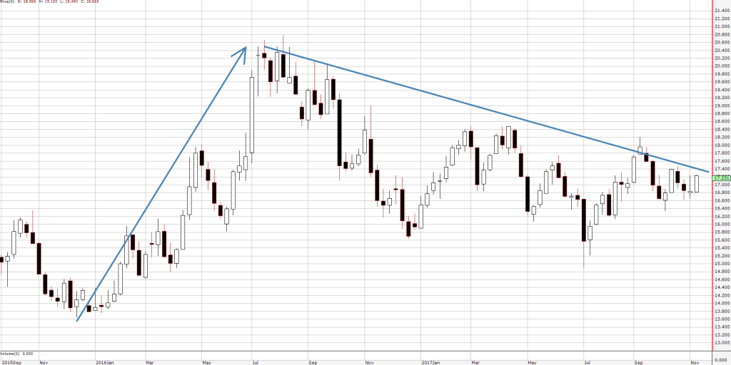
The chart for silver is looking very interesting here and we could soon be seeing an opportunity to buy silver stocks if prices break to the upside. A recent article in the Australian Financial Review noted that silver prices have drifted lower. When we look at the chart though, we can see that the pullback doesn’t appear very bearish. Below is a weekly candlestick chart for the spot price of silver, in $US per ounce.

How we read the silver chart
From the November 2015 low, it rallied quickly from about $13.80 to over $20 in the space of 8 months. Now, 15 months later, the price has not been able to head back under that 2015 low. So in nearly twice the amount of time, the bears have been unable to dominate. We are therefore seeing the previous metal ease back in a “flag” formation, which is a good sign. Once it breaks above this flag, it will be ready to trend higher again.
Ideally, a move above $18 would trigger a buy recommendation – in our opinion. That could then result in a 10%+ rally in the silver price as it goes on to retest last year’s high.
What do we do now?
For the moment we are sitting on the sidelines, but we are watching for the break out. A 10% move in the price of the previous metal could result in a more than 10% move in any Australian listed (ASX) miners who are exposed to silver. (Click here to purchase our research to be notified of the buy recommendations, or you can click here for a free trial).
Michael Gable is managing director of Fairmont Equities.
Sign up to our newsletter. It comes out every week and its free!
Disclaimer: The information in this article is general advice only. Read our full disclaimer HERE.
Like this article? Share it now on Facebook and Twitter!

