

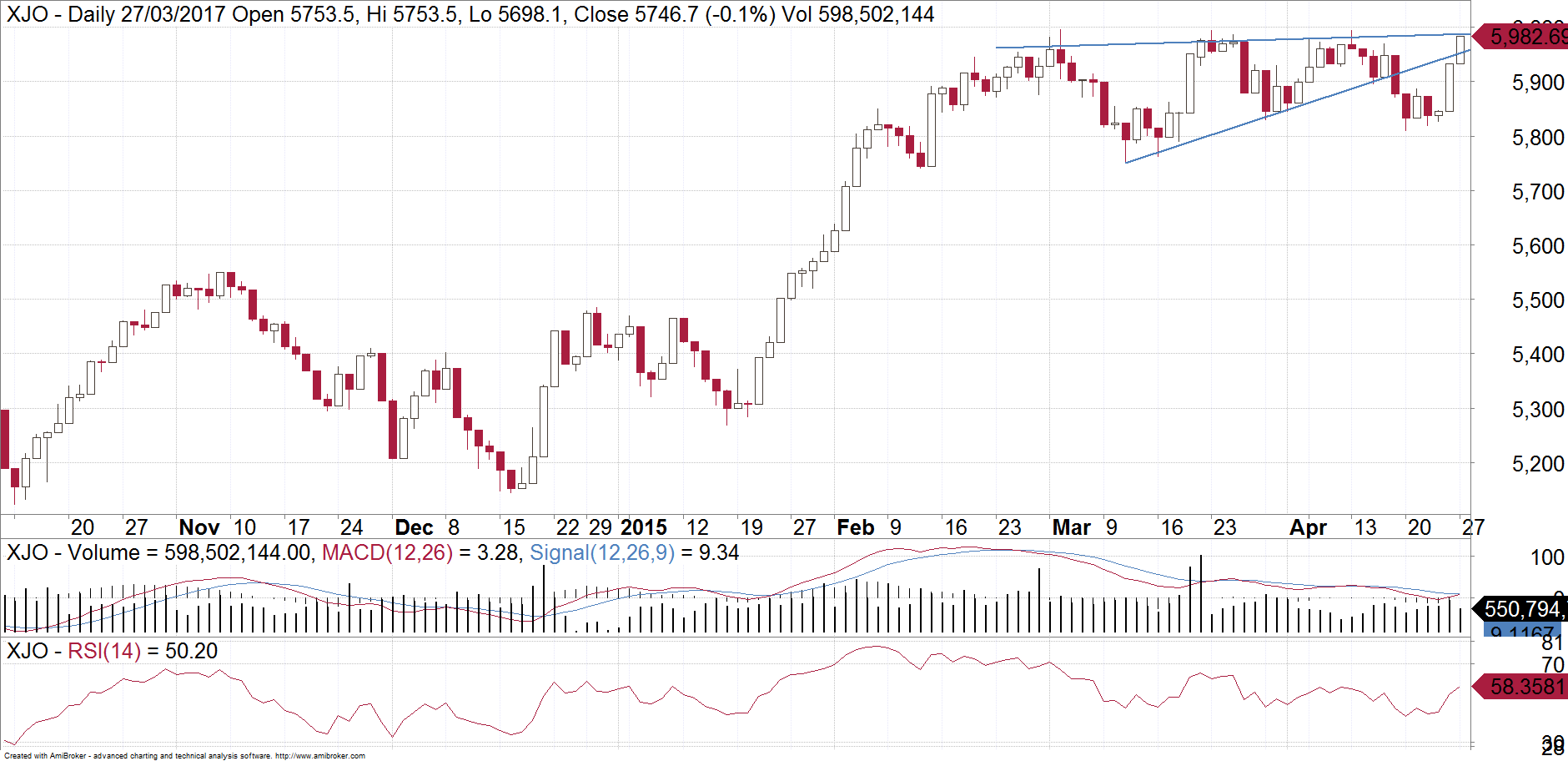
Patterns and investor behaviour repeat themselves in share markets. The current chart pattern on the ASX200 looks uncannily similar to one from two years ago. Below is a daily chart of the ASX200. Have a close look. One could be forgiven for thinking that it is a current chart, but it is actually from 2015.
Now have a look at the following chart. This is the ASX200 as at today.

What some people thought was a bullish triangle on the ASX200 has proven to be the opposite. Triangles normally break within about 2/3 – 3/4 of the way through. By converging to a point last week, the XJO was at risk of either making a small unsustained break to the upside, or a break to the downside. It is clearly broken to the downside now. This triangle is most likely a rising wedge. We are now retesting last week’s break just under 5800. The market is trying to test the patience of the “buy the dip” crowd. This implies at the very least a pullback towards the base of the wedgewhich is just under 5600 but it is likely to extend down towards the 5400’s.
Our first chart from 2015 resulted in a drop to under 5000. It is impossible for me to predict such a large sell-off but at the very least investors should be a bit cautious and expect more chance of downside than upside over coming weeks.
There are ways to hedge your holdings. Contact us to find out more.
Make sure you bookmark our main blog page and come back regularly to check out the other articles and videos. You can also sign up for 8 weeks of our client research for free! Otherwise you can email Michael Gable directly at michael@fairmontequities.com
Disclaimer: The information in this article is general advice only. Read our full disclaimer HERE.